Every influencer you know uses This Secret in their content.

"Claustrophobic. Oppressive. Mediocre."

The words above are what I feel when I look at most people’s content.

These same things are being felt about some of your content right now.

But your fans can’t articulate their feelings, instead, they’ll just bounce.

Successful influencers don’t really have this problem.

People actually LIKE their content.

But for most people, it goes like this:

Every time I see I piece of content...

I think “it’s too cluttered.” Because people are taught to create content, but aren’t taught to polish it. They’re taught ‘more is good’, when the opposite is often better.

Steve Jobs understood this. Beyoncé gets it. They used one key principle to  make sure people felt good about their content. And if you pay close attention, by the end of this article, hopefully you will too. Let’s go!

We'll start with Evan Carmichael.

Evan Carmichael - Breathable Content

The quality of Evan's creations has grown.

And over the years, I’ve been instrumental in that growth.

Videos, animations, songs, guides, lists, posts, landing pages, product demos, PDFs, books… you name it, I’ve helped them all #ryze.

And the most important principle I apply when making Evan’s content better is…

Breathability.

So what, is ‘breathability’, you ask? We-ell… it can be tricky to pin down, and often appears as a combination of different things. And there’s a reason for this. 

Breathability isn’t a set of ‘do this, do that’ instructions… it’s a mindset. For example:

In writing, breathability is white-space, font-weights, line-spacing, etc.

In music, breathability is silences, vocal emphasis, bridges, etc.

In photography, breathability is negative space, framing, the rule of thirds, etc.

Breathability is a key factor in making any content great. This goes for video, interior decor, anything you can think of.

But what’s the big deal? Why does it matter if you haven’t learned about breathability?

For one thing, clutter is distracting.

If you’re like most people you want to create great content.

But no matter how many tools you use, what tech you apply, or how much time, money, and energy you spend…

Your content may still feel average.

Why? Chances are it’s cluttered.

This is solved when you approach your content with breathability in mind, and insist on a generous amount before you ever click post, publish, or share.

Successful people “get” this.

Steve Jobs - Minimal Whitespace - BreathingSteve Jobs made sure Apple’s design aesthetic was never cluttered. He insisted on tons of ‘breathing room’.

Beyoncé is intentional with fashion, choosing one statement piece to build her outfits around, rather than cramming all her best pieces together.

Larry Page knew a huge reason why people preferred Google over Yahoo was their ultra-clean, ultra-simple homepage.

A focused, attentive consumer is a win for you and your content. A distracted consumer is a loss.

Besides that, awkwardness is amateur.

I don’t know any consumer who fills their feed with amateur content.

Sometimes, a piece of content will have enough breathing-room, but it’s poorly spaced out, poorly timed, poorly organized. Awkward.

Awkard breathability is almost as bad as not having breathability at all.

When I see awkward content, it just feels… lame.

Which is sad, because the creator probably had a great message. They probably really want to help people.

But one glance sends me the message that it’s amateur.

And amateur things aren’t really compelling. Their message might be worth people’s time, but that’s not the feeling we get from the presentation.

There’s millions of amateur creations out there, nobody is hungrily seeking them out. Consumers, understandably, want a great experience when they engage with a piece of content.

They don’t want an awkward, amateur experience.

Meal Plated - Breathing Room - Indian_Dal

Sadly, you could cook a 5-star meal...

…but if it’s served as a giant mish-mash, people are likely to pass it by.

Maybe you bought all the freshest ingredients, but if they’re all slapped together blending into each other on a tiny, rusty metal plate…

People take one look at the cluttered, awkward hodge-podge and think:

“Nah, I’ll just go to the restaurant next-door.”

And on the flipside, an average meal can actually impress the hell out of people. Make it an appropriate portion, served in the center of a pure white porcelain dish, with lots of breathing room, and matching serviettes & tablecloths. Voila, impressive content.

If you want people to consume your content, if you want them to perceive it instantly as mouth-wateringly good…

Breathability is key.

Some breathability examples would help.

So let’s see how Evan and I applied breathability to his book, Built To Serve, and his #BestLife30 series.

Evan’s book began as a wall of text.

Evan writes good books.

In fact, his latest, Built To Serve, is the best business book I’ve ever read, period, and with my standards, that’s not to be taken lightly.

But often times, when we’re focused on writing valuable content, ‘breathability’ gets ignored, and we end up with monotonous, densely-packed content.

Breathability solves this.

I’m gonna repeat what I said above because it’s so vital.

Breathability is what lets people consume your content enjoyably.

And more importantly:

Lack of breathability stops people from consuming your content.

Without breathability, your fan’s eyes glaze over, and they toss your brand into a mental box labelled ‘mediocre.’

A page with 100 great ideas scribbled all over it is suffocating. It looks and feels like chaos and hard-work to decipher.

A page with 1 focused idea, generously spaced out & delivered, is easy and compelling.

But even then, with say, one idea on a page, there can still be breathability issues.

Imagine if the idea was written as one giant paragraph, edge-to-edge on the paper.

Ew. A giant wall of text, right?

Much better to inject some ‘breathing room’ with paragraphs, line-spacing, headings, sub-headings, etc. 

Breathability can apply to the amount of elements on a page. Breathability can apply to the amount of space in your paragraphs.

Breathability can apply to… well… everything.

Luckily, most people instinctively “get this” on a sub-conscious level.

That instinct is why Evan writes his books with 1 easy-to-digest concept per page. It’s why he’ll often write a paragraph, followed by a single, solitary, ‘impact-line.’

Built To Serve did this well, right off the bat.

So, okay, it had some breathing room.

It wasn’t JUST a wall of text.

Evan’s natural writing style leverages a bit of breathability.

You can see some of the breathing room circled in red below.

Which puts it ahead of a lot of content out there, all without Evan even encountering the term before.

But Evan believes in testing.

I’ve never known him to settle on a creation without testing it on audiences first with an open mind for feedback.

And when he got feedback on his first draft suggesting he inject even more breathability into his book, he reached out to me to turn it up.

I suggested a bunch of breathing-room ideas:

Content Breathability Tweaks And Tips
Dividers, Quotables, Illustrations, & Exercises

I suggested using Section Dividers, Quotables, Illustrations, Exercise pages, and a bunch of various other breathing-room tips and tricks to break up the walls of text.

The first 3 made it into the book as breathability tweaks. The 4th evolved into a 30-page accompanying Scorebook.

Here it is with some breathability added.

To start applying it, Evan began with the text. We tweaked fonts, spacing, and text-formatting to add breathing room.

The huge difference increased breathability made is hopefully obvious, but here’s some of the key points.

  • Generous line-spacing.
  • Indented bullet-list.
  • Page-runners, headers, footers.
  • Ample white space before the page even starts.
  • Large swathes of space sandwich-ing the quote.
  • Font is thinner, cleaner, with more variation on the bolds & headers.

Before a potential customer reads a single word of this book, they get a feeling about it, just from the way it’s laid out.

Flipping through it, they feel “Wow, so cleanly laid out”, “Wow, this is pro”, “Wow, this book is probably more valuable than average.”

They don’t say this out loud, or even think these thoughts, but on a primal level, they feel this and their decision to consume the content is influenced.

All because of the breathability.

And we haven’t even talked visuals yet.

The text had gotten a nice breathability treatment, next up, imagery.

We decided to add illustrations throughout the book, to let all the text ‘breathe.’

Simply inserting a ‘title card’ or ‘hero image’ gave people’s eyes a rest, paved the way for a great reading experience, and emphasized each section’s most valuable points.

And just look at that beautiful illustration (if I do say so myself).

It’s clean.

It has one main element with some supporting text.

Generous breathing room.

It just says “Step 2, Your Why”, with a symbolic stick-man climbing higher and higher.

That’s it.

Simple, spacious, focused, effective.

20+ visuals like this were spread nicely throughout the book at spots that made sense.

Breathability had been levelled up.

"But I Can't draw!" (All good, Selfies work too.)

You don’t need to be a rocket-scientist to add breathability to your content.

Just have the restraint and discipline to give each element the space they deserve, and it almost doesn’t matter what they are.

Your content could be anything from grainy old baby photos, to iPhone selfies, to videos.

If they’re presented intentionally, with ample breathing-room, people are very likely to resonate.

See how drastically white space, well-timed visuals, and text-polish elevates Evan’s book? Breathability.

Best. Decision. Ever.

It’s the ingredient average creators neglect, and great creators insist on… for everything.

Let’s take a look at one more example from Evan.

Case Study 2: Evan’s #BestLife30 series.

It all started like this:

“yo yo! Do you still have that one-pager you made way back as a PDF for a Top 10 video? Got a crazy new idea”

Evan Carmichael - One Pager

Evan was referring to a one-pager I made which summarized his Gaur Gopal Das Top 10 video.

And his ‘new crazy idea’ was to create a free series called #BestLife30. It’s a 30-day program covering everything from inspiration to habits to business strategy.

A  series to help people live their best month ever.

The initial idea was that each day, subscribers would be delivered an actionable one-page PDF, along with video accompaniment.

It’d be a lot of valuable content.

I was psyched to help it come to life –> #IdeaToAction 🙂

So I did my best to add every element Evan wanted to the sheet, below is the first result.

This was pretty content-dense.

Although I poured effort into getting the spacing & clarity just right, this one-pager ultimately sacked breathability just to get the most content on the page as possible.

And then Evan mentioned there’d be five points per page, not just one.

A breathability nightmare, but I gave it a shot.

Our second draft actually got worse!

This is what happens when you try to put too many elements in a limited space.

The right thing to do is either buckle down and cut some elements, or allow them all to breathe by using a different format with more space.

So we spread it out into a slide-show.

Evan had a slideshow from a previous webinar, so we figured we could start with that.

It definitely allowed for a lot more breathing-room than a one-pager, but it was still kind of cluttered.

It needed a lot of changes.

It needed breathing-room.

It needed cleaner fonts, colors, and icons.

It needed subtler greys, hints of orange, a digestible layout.

It needed elements that weren’t so distracting and heavy on the eyes.

And most of all…

It needed an abundance of breathability.

So I took the slideshow and turned it into this:

Now, technically it’s possible to add too much breathing room, making the piece look unbalanced, or like something is ‘missing’, so you have to feel it out or test it on audiences, but once you nail breathability, it makes a huge difference. 

For the slideshow, it was a night and day transformation from the crammed-together original one-pager.

It turned out so much better.

Why?

Because we didn’t rush it out. We put the draft through multiple breathability assessments.

We took the time to polish and revise. We took the time to make sure each quote, photo, headline and paragraph had a high level of breathability.

And Evan's not the only one who uses breathability.

Taylor Swift - Whitespace Minmal Breathability
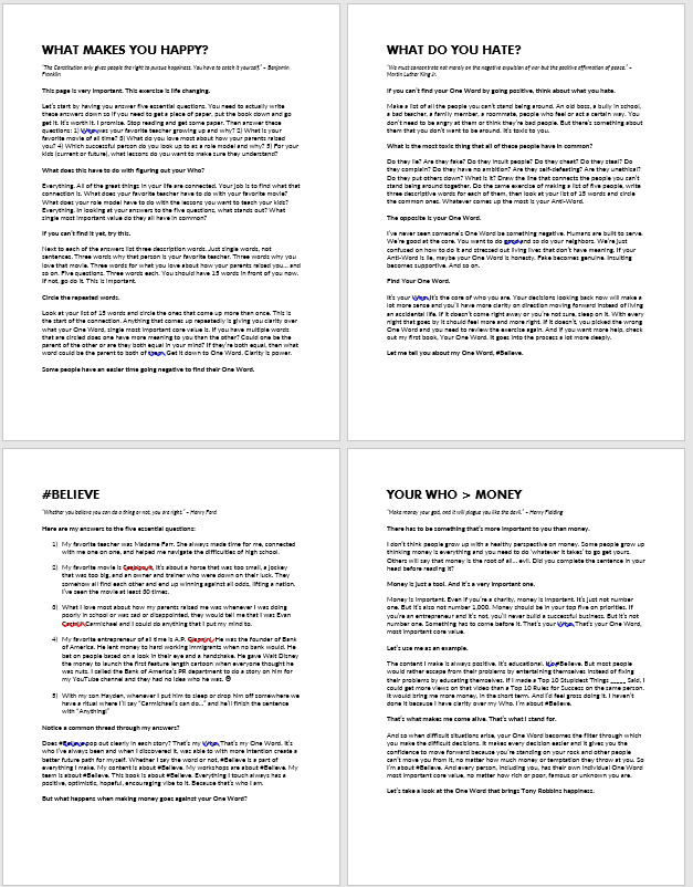
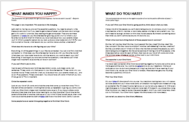
You can pick almost any content creator you look up to, and while they may not use Apple-level breathability in their content, I guarantee you they’re at least decent at breathability. They don’t neglect it.

Look at Nike’s ads, Nolan’s directing, Swift’s song-writing, Oprah’s interviewing, Rowling’s writing, Obama’s speeches, Tech Crunch’s blogs,  Dave Chappelle’s comedy.

Really, look at any great piece of content.

Aim to get yours to a similar level, figure out ways to inject breathability into your creations.

Even someone like Eminem —who seems to cram a thousands of words into a single rap— leverages breathing room.

He makes sure there are words, phrases, and impact lines people can latch on to and sing-a-long with.

He makes sure the instruments become sparse when he’s rapping rapid fire.

He makes sure that even though some pieces are super-dense… there’s enough ‘room’ in his content for people to digest and appreciate it either musically or lyrically.

To summarize:

Breathability is essential for truly great content.

And I was going to end the article here, feeling it to be a decent introduction to a very in-depth topic. But…

Then I was emailed a breathability question.

It was sent by Cynthia, a Soar client.

Cyn was making a meme about #SlayingShame for her instagram feed, and she knew I was writing about breathability.

She wanted her content to be great, and she knew she needed to add breathing room.

But she wanted to make sure she understood fully, so….

She emailed me through the Soar website to ask for advice.

She sent a nice email, with this question inside: “It sounds like breathability takes many forms, so how do I know if I’m applying it right?”

Below is the email I wrote in response:

“Thanks for writing Cyn, I appreciate it...

I’m Glad you enjoyed the ‘breathing room’ case-studies!

And yes, Evan really turned-up a lot of his content with this simple concept.

It’s pretty easy to apply to your own stuff, but it requires something most people avoid…

Taking the time and energy to think differently.

When you create a piece of content, it’s vital to step back, reflect, and really ask yourself:

  • ‘Could the message be clearer?’
  • ‘Does this element image (or word) have too little breathing room?’
  • ‘Am I cramming too much in here? Would this be more valuable if I removed something?’

Sadly, the answers for most content clients present to me are of yes, yes, and yes.

And sadder still, they refuse to ask those questions of their work. What’s more, they avoid admitting the truth about their content.

They won’t admit they rushed it out, without a polishing phase.

They won’t admit they didn’t bother inspecting & imitating truly great content.

They won’t admit their content is cluttered, confusing, and unclear.

Instead, they just “did whatever” they felt like, called it “great”, and published it.

Then they wonder why no one pays attention.

Consumers deserve a pleasant, enjoyable, consumption experience… anyone who refuses to give them that will get ignored and passed over for someone who will.

It’s that simple.

And like I said, breathability is easy to add. In fact, it often requires less work, ‘cause you can put say… one to three elements on a page, and that’s it. That’s a wrap.

It actually saves you work sometimes.

The real trick is in having the self-awareness to assess your creation and acknowledge the truth about it.

And the real trick is practice.

When you see an ad or a billboard, ask yourself the above questions. When you see a competitor’s content, be honest, is theirs more ‘breathable’ than yours? When you publish your own, and no one bothers with it, did it fail ‘cause of the message? The word choice? Lack of breathability? Perhaps all three?

If you can be honest about that, you’ve got it in the bag, if you can’t… well, it’s not the end of the world, you’ll be like most content out there I guess, which is serviceable enough to ‘get by.’

So what happens when  I ask people how they honestly rate their content?

Hilariously, most people rate themselves at an 8 out of 10… on everything!

Content creation?
“I’m about an 8.”

Focus?
“Yeah, I’m an 8.”

Creativity?
“I’d say I’m an 8.”

Sheesh.

How can they ever expect to improve if they’re blind to where they are, and where they need to go?

But I’m sure that’s not you. If you’re writing me, hopefully you want to truly Soar.

So, this is the kind of in-depth advice I don’t usually get into in an email, but you’re #ryzing up, so I figured I’d write a bit more in-depth.

Hope it helps, and either way, I wish you lots of success.

#TogetherWeSoar
-J”

I hoped she'd take my advice to heart.

‘Cause the truth is many people read, but fail to apply.

I didn’t want her to be one of them. Her message was great, but it’s so easy to fall into old habits, creating a crowded browsing experience for consumers.

Her youtube channel could blossom by adding breathing room to her thumbnail-text.

Her IG would do better with a clean grid.

Her website would perform better by ditching many links and buttons.

Cyn Blue Lipstick - RyzeKinkMost importantly, her brand would SOAR.

If she was able to see this stuff, she could self-assess her content, and admit if it was a 1, a 5, or a 10 on the “breathing-room” scale.

And if she could admit it, she could fix it.

And if she fixed it, people would love it.

Be adored, not bored, or ignored.

Take a moment to imagine what your content could really be.

Imagine if you put in a few days of solid work, and really  increased the breathing room on all your offerings.

Imagine if your YT grid was clean, with a unified color-scheme, uncluttered images, and bold text surrounded by ample whitespace.

Imagine if your IG bio was now just 3 simple lines, each one using well placed emojis and spaces to draw people’s attention.

Imagine if your website was one big headline & a button, surrounded by a spacious hero image.

I bet you’d feel good about it, you’d feel proud, and I bet your fans would too.

But the only way to know for sure is to do it, test it, and see for yourself.

Personally, I’d bet that if you do it well, with heart and care, you’ll get praise like the following:

  • “OMG dude, your new look is so pro!”
  • “What I like most about your content is it’s so digestible. You must have a huge team!”
  • “Holy, this is so clean. (fire emoji). Keep it up!”

I bet your follower counts will climb, your email sign-ups will increase, and your customers are happier to share your posts.

I bet increased breathability will be one of the most impactful improvements you ever make to your content.

The question is…

Will you?

...plus 3 more quick tips!

Applying breathability is easy, but most people are so excited to get their content out… that they neglect to do it.

That’s why I made this clean, clear, 6-point quick-reference for you.

Do yourself a favor and keep this handy quick-reference nearby on your desk, as a PC wallpaper, or a swipe away on your mobile device.

It’s completely, totally, 100% free.

Get your free quick-reference instantly.

Or if you want personal access to me...

JRyze_Advice_Icon
RyzeSessions — Get Weekly Q&As with J, tailored specifically to YOU.
J-Ryze_Wisdom_Cartoon

advice from the so-called ‘experts’ hasn’t really helped you.

That's why J-Ryze offers tough love that works.

Learn more about his Facebook Group & how to get personal access to him.